Web App Design
PROOFPOINT
PROOFPOINT
Proofpoint, a leading cybersecurity training provider, engaged our team to reimagine their security training platform with a focus on driving user engagement. Facing increasing competition, they sought a modernized UI and strategic feature enhancements that were both feasible and impactful. Through in-depth research, user testing, and iterative design, we developed a solution that not only improved usability but also encouraged meaningful user participation, making security training more intuitive and effective.
Role
UX / UI Design
Company
Slalom
Duration
4 Months
I facilitated a workshop, tested feature ideas with users, designed the experience, and collaborated with developers to deliver the MVP.
Our challenge was to combine the acquired products into an intuitive interface while, at the same time, seeking to add new capabilities
Our challenge was to combine the acquired products into an intuitive interface while, at the same time, seeking to add new capabilities
Running a Strategic Workshop
I led a hands-on workshop with stakeholders to generate features, align on business goals, and prioritize ideas based on user needs. This collaborative session provided a foundation for the redesign, ensuring that solutions were both impactful and feasible.
Over the course of the project we conducted 20+ interviews with subject matter experts and existing users to better understand the challenge as well as potential opportunity areas
Over the course of the project we conducted 20+ interviews with subject matter experts and existing users to better understand the challenge as well as potential opportunity areas
Designing and Prototyping
I was responsible for designing and prototyping all screens, ensuring a modern and intuitive user experience. Each design decision was guided by research insights, accessibility best practices, and a focus on driving engagement through clear, actionable interfaces.
Incorporating the insights learned in the previous two phases, our team designed a high-fidelity, clickable prototype to share with the client and refine via user testing
Incorporating the insights learned in the previous two phases, our team designed a high-fidelity, clickable prototype to share with the client and refine via user testing
Validating Ideas Through User Testing
Blueprinting
I conducted user desirability testing to validate key hypotheses and feature concepts with real users. This research provided valuable insights into user behavior and preferences, allowing us to refine our approach before moving into design and development.
Next, we synthesized our findings from our research into a service blueprint and application map that would serve as a north star for prototype development and user testing
Next, we synthesized our findings from our research into a service blueprint and application map that would serve as a north star for prototype development and user testing
Collaborating with Development
Delivery
To bring the vision to life, I worked closely with developers to ensure the successful implementation of the MVP. Through regular check-ins, design handoffs, and iterative improvements, I helped bridge the gap between design and development, ensuring a seamless final product.
Prior to handoff, we compiled a style guide consisting of over 60 reusable components that would serve as the building blocks for a cohesive design system
Prior to handoff, we compiled a style guide consisting of over 60 reusable components that would serve as the building blocks for a cohesive design system
To kick off the project, we partnered with the client to run a two-day workshop, bringing together stakeholders from cross-functional teams. The session focused on defining the future product vision, aligning on key priorities, and generating feature ideas to enhance user engagement.
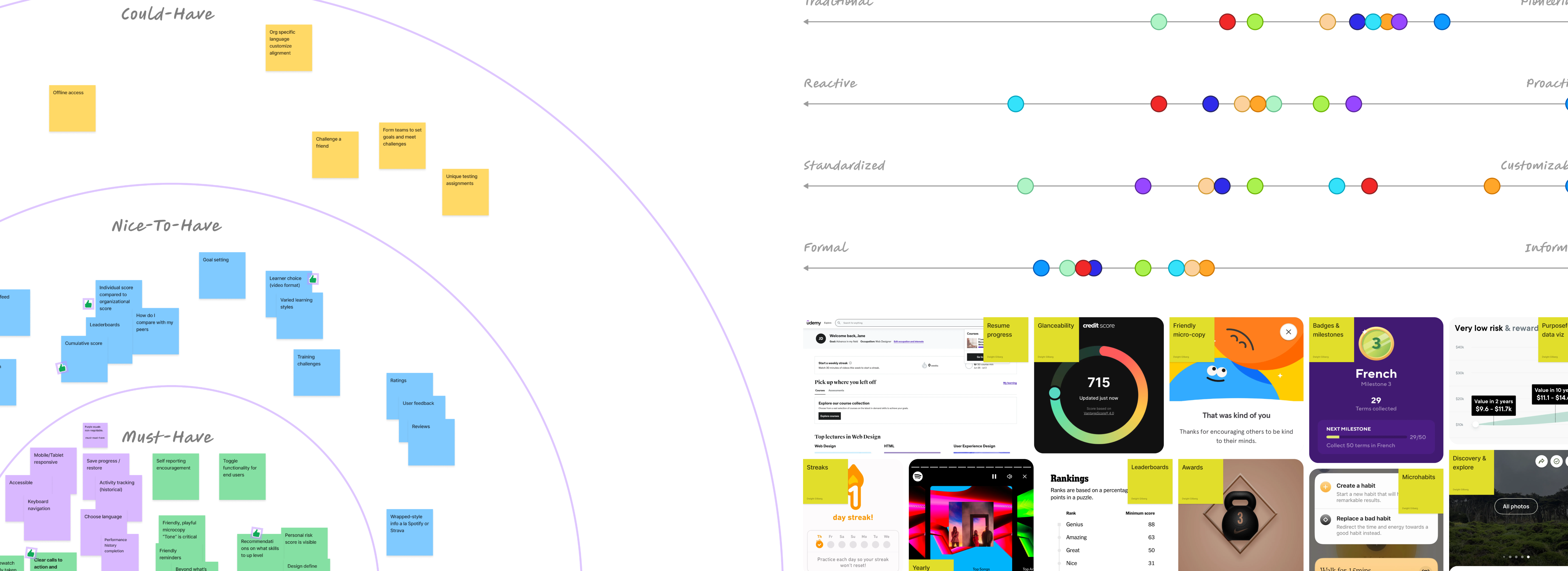
Sample Workshop Exercises (Left to Right): Priority Circles, Experience Continuum, Wall of Awesome
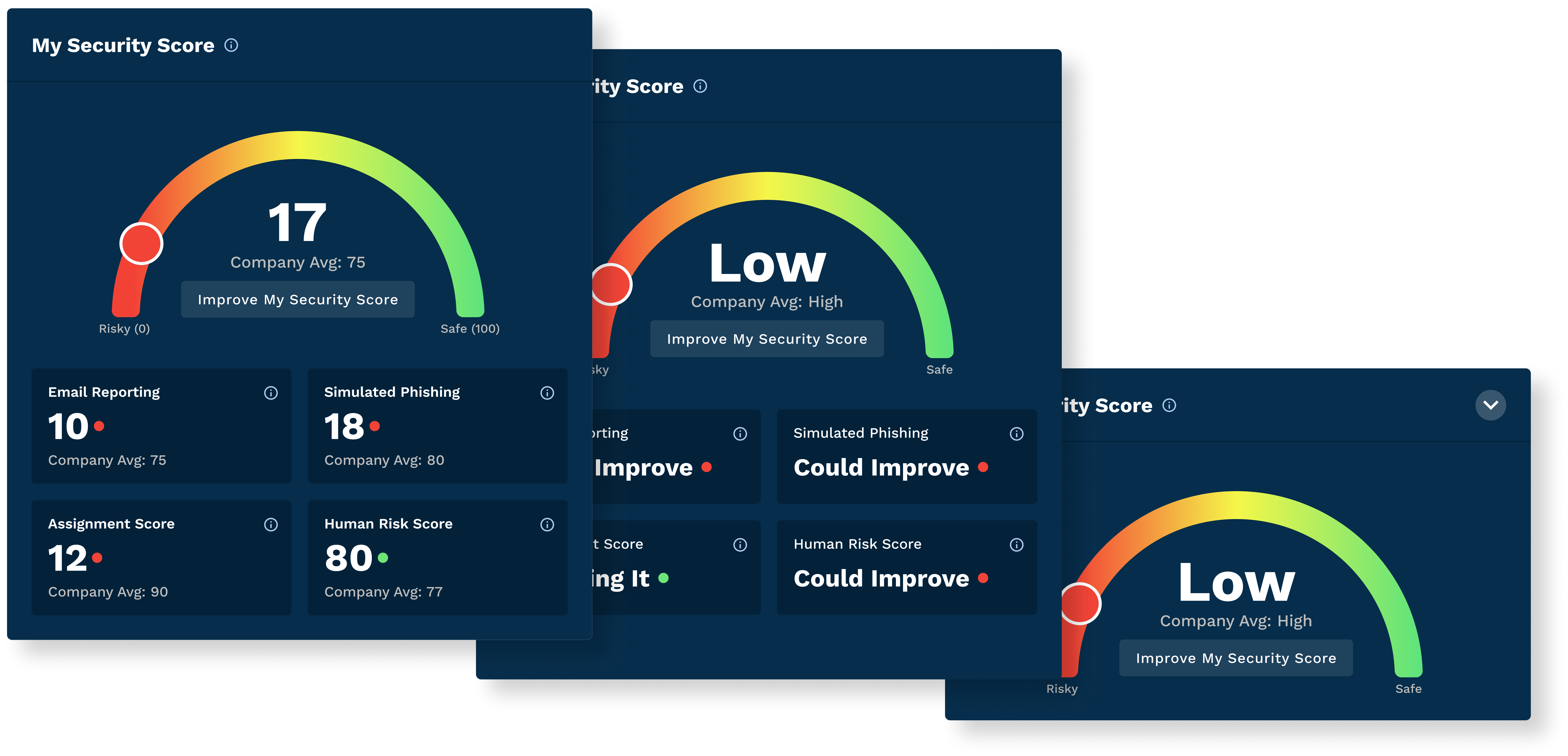
Using the high-priority feature ideas from the workshop, we created multiple concepts to test with users. Our focus was on two key aspects: the level of gamification users preferred and the ideal level of granularity for the Security Score—a new concept designed to help users gauge their risk of cyber attack.
Identifying The Design Approach
The first test focused on finding the right level of gamification, revealing that customers preferred a balanced approach—keeping assignments front and center with subtle gamification to enhance engagement without distraction.
“I want to see my assignments right up top, so I know what trainings I need to finish.”
“I wish there were a little more of the gamification ideas in the Informative option to motivate me to do better."
Dashboard Concept Ideas (Left to Right): Gamified, Balanced, Informative
Dashboard Concept Ideas (Left to Right): Gamified, Balanced, Informative
Detemining The Level Of Granularity
The second test explored the ideal level of granularity for the Security Score. Users consistently preferred the highest level of detail, as it provided greater clarity on how their score was calculated and the specific actions needed to improve it.
“Seeing the numbers brings out my competitive spirit and makes me want to beat company average."
"I like the numbers in the most detailed option - it feels much more meaningful and actionable to me"
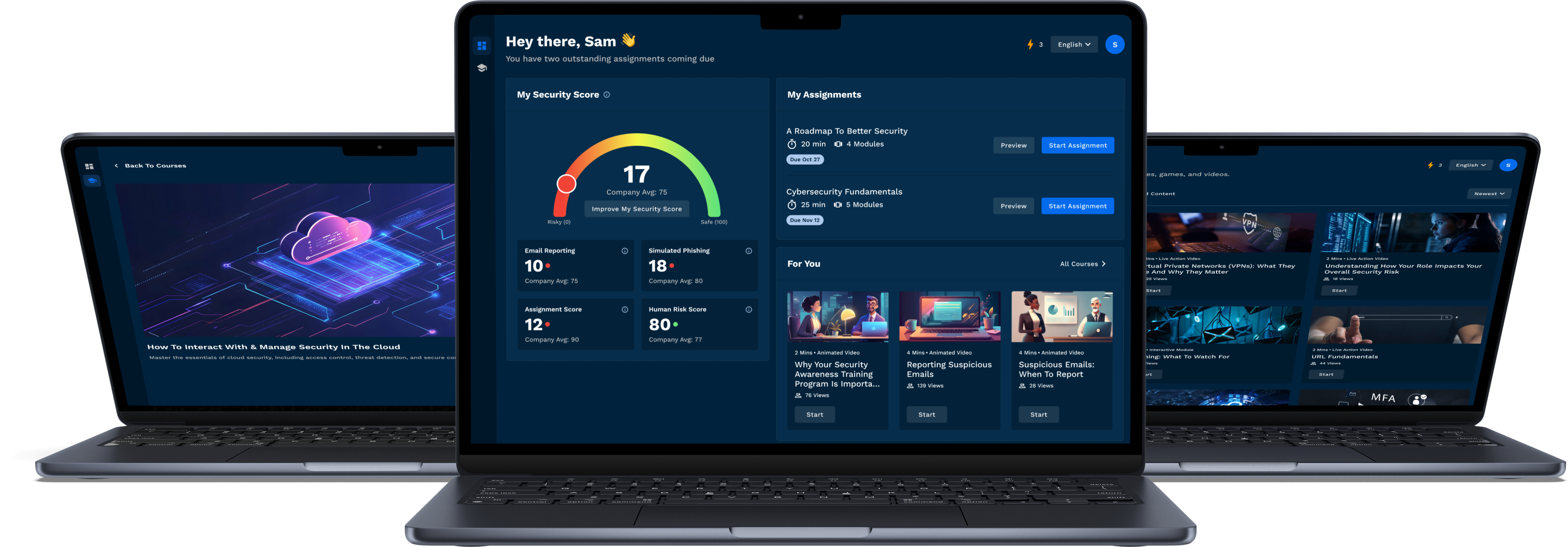
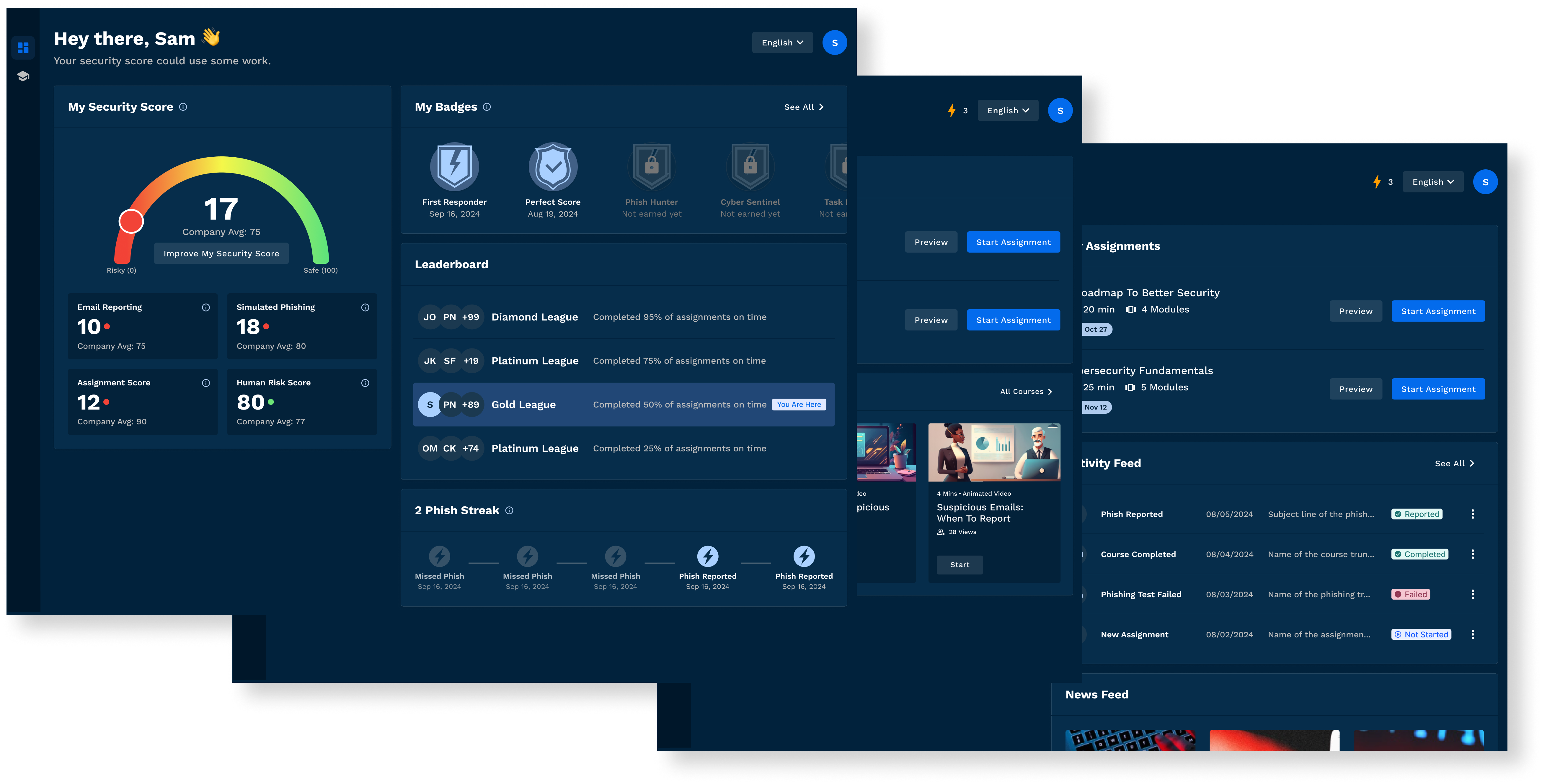
Using the takeaways from the user testing and the workshop, we designed a dashboard, a course page, and a new video player, all of which serve as the foundation for the MVP.
After completing research and drafting the guiding documents, a clickable prototype was designed for testing
The Dashboard
A Connected Experience
The dashboard creates a connected experience around the Security Score. Dynamic modals guide improvements, the 'For You' section personalizes content, and increased score granularity enhances transparency. Metrics are displayed with company averages to clarify scoring and boost motivation, reflecting user feedback from testing.
Users needed a way of understanding deal progress in order to quickly communicate status to their clients when necessary. To enable this, we designed a tracker summarizing the four major steps of a deal so that legal professionals could easily view and communicate progress. An activity feed and task list provided additional visibility into potentially relevant items without the need for multiple clicks.
The Dashboard
Assignments Front & Center
Assignments remain front and center, aligning with user feedback from testing. We streamlined the experience by making it easy to preview assignments and modules, track progress, and quickly grasp key details like duration, module count, and due dates.
Users needed a way of understanding deal progress in order to quickly communicate status to their clients when necessary. To enable this, we designed a tracker summarizing the four major steps of a deal so that legal professionals could easily view and communicate progress. An activity feed and task list provided additional visibility into potentially relevant items without the need for multiple clicks.
Assignments remain front and center, aligning with user feedback from testing. We streamlined the experience by making it easy to preview assignments and modules, track progress, and quickly grasp key details like duration, module count, and due dates.
The Dashboard
Motivation Without Distraction
Streaks were introduced based on user testing to encourage intrinsic motivation through assignment completion. To balance engagement without making the interface feel overly gamified, we placed them in the top navigation—keeping them visible but unobtrusive to the main actions users need to take.
Users needed a way of understanding deal progress in order to quickly communicate status to their clients when necessary. To enable this, we designed a tracker summarizing the four major steps of a deal so that legal professionals could easily view and communicate progress. An activity feed and task list provided additional visibility into potentially relevant items without the need for multiple clicks.
The Course Player
Clear Progress, Seamless Navigation
We improved the course player’s navigability by previewing courses within a module and offering multiple ways to advance—either by clicking ‘Play Next’ or selecting a course thumbnail. These updates address a key user pain point: wayfinding and understanding progress within an assignment.
Users needed a way of understanding deal progress in order to quickly communicate status to their clients when necessary. To enable this, we designed a tracker summarizing the four major steps of a deal so that legal professionals could easily view and communicate progress. An activity feed and task list provided additional visibility into potentially relevant items without the need for multiple clicks.
After four months, we delivered an MVP shaped by stakeholder input from workshops, user insights from testing, and multiple iterations. The result is a solution that meets user needs while positioning Proofpoint for future success against competitors.
Lessons Learned
Lessons Learned
Bringing Stakholders Along The Journey
Minimize learning curve
Bringing stakeholders along the journey was crucial to success. By advocating for and conducting the workshop early, we gained valuable organizational buy-in, ensuring alignment on key ideas from the start. This not only helped streamline decision-making but also laid a strong foundation for the MVP, setting it up for long-term success.
Validating With Users
Minimize learning curve
Many of our initial assumptions were proven wrong through user testing. Running these tests allowed us to challenge our expectations and make data-driven decisions based on real user behavior. This reinforced the importance of validating ideas early to ensure we were building solutions that truly met user needs.